A signup popup can look right in the editor and still get in the way on the storefront. A full-width photo crops the offer on mobile, the close button disappears into the image, or a customer who just dismissed the form sees it again on the next page. Those are three different problems: layout, interaction, and targeting.
Here’s how I’d set up a Klaviyo email popup for a Shopify store. The goal is a form that makes a clear offer, works on a narrow screen, and lets shoppers get back to what they were doing.
Build the offer as text before choosing the photo
Say what the visitor gets and what they need to do. For a clothing shop, “Get 10% off your first order” is clearer than “Join the club.” Keep the headline, any offer conditions, the email label, and the button as real form content. If the entire offer is baked into a background image, it can become unreadable when cropped and difficult to update when the promotion changes.
Try a side image on desktop and a compact form on mobile. In Klaviyo’s side-image guide side images are hidden on mobile by default to leave room for the form. Preview both layouts. If you use a background photo, put the copy over a solid panel or an overlay with enough contrast, and make sure the close control stays clear wherever the image crops.
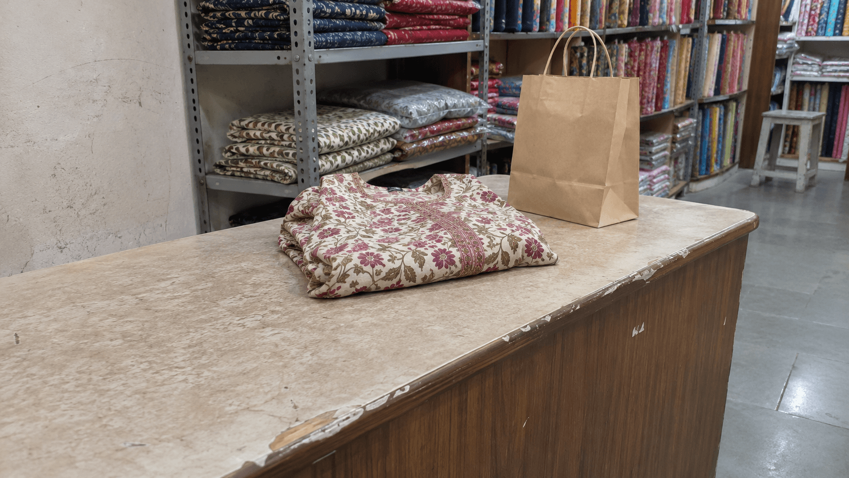
A patterned garment and plain paper bag on a worn shop counter. Fictional AI-generated editorial image.
Fictional editorial image: a folded garment at a shop counter. A product photo can set the mood without carrying the offer text.
Show the form when it makes sense
Klaviyo’s Targeting & behavior guide separates display rules, such as timing, frequency, and device, from targeting rules, such as audience and URL. Start with one simple rule you can explain to the store owner, then add exceptions when there’s a reason.
For example, let a new visitor browse a product page before showing the offer, exclude the cart if you want a quiet path to checkout, and set a sensible delay before showing it again after dismissal. Those are starting choices, not universal settings. Compare the signup rate with what happens to product browsing and add-to-cart activity. A form that collects more emails but disrupts shopping may need a different trigger.
Test both an anonymous visitor and a recognized subscriber. Audience rules that rely on profile recognition can behave differently when privacy settings prevent that recognition. Check the relevant consent states on your own storefront before treating a repeat display as a broken setting.
Make closing the popup as easy as opening it
Use a visible close control and a real label for the email field. Don’t rely on a placeholder that vanishes as soon as the shopper types. Try the popup at a narrow viewport with the on-screen keyboard open; the email field, submit button, and close control should still be reachable.
For a popup that behaves as a modal, the W3C modal dialog pattern is a useful test guide. Check that focus enters the dialog, Tab stays within it while it’s open, Escape closes it, and focus returns to the trigger or another logical place. If a form opens automatically, check where keyboard users land after dismissal. Test the actual storefront, because seeing the right layout in the editor doesn’t verify keyboard behaviour.
Troubleshoot a popup that never appears
Check the basics before changing the design. Klaviyo’s Shopify setup instructions say the Klaviyo app embed needs to be enabled in the Shopify theme for storefront display. Check the theme you’re actually testing, the form’s status, and whether the URL, device, and audience qualify. An earlier dismissal in the same browser can also make an otherwise working form look broken.
- Open a fresh browser profile, visit an eligible product URL, and wait for the configured trigger.
- Dismiss the form and reload. Verify the repeat display behaviour you intended.
- Submit a test address you control. Check the confirmation step and the destination list, and verify the email follow-up if the offer promises one.
- Repeat on a real phone and with keyboard navigation. Test a page that should be excluded too.
For related storefront work, see my Baby Blossom Shopify theme project. If your signup form looks fine in preview but behaves differently on the storefront, I can help trace it from the theme embed through the display rules and mobile layout.