
You upload a sharp new banner to a Shopify store, check it on your laptop, and everything looks fine. On a phone, the page opens with an empty space while the headline and buttons wait for the photograph. Compressing the file might help, but it might not address the reason the image starts loading late.
A useful fix starts with three questions: which image matters on the first screen, when does the browser discover it, and how much image data does that device actually need? Here is a practical way to answer them in a custom Liquid theme.
Find the image that is actually slowing the first screen
Largest Contentful Paint, or LCP, measures when the largest eligible image or text block in the viewport is rendered. It might be a homepage banner, a product photograph, or a heading. Google’s LCP optimization guide explains why the whole loading path matters, including resource discovery and rendering delays.
Before editing, open a duplicate theme in storefront preview and record a mobile performance trace. Note the LCP element, its request URL, when the request begins, its transferred size, and when it finishes. Keep the same viewport and network settings for comparisons.
If the image finishes downloading early but appears much later, investigate what is holding back rendering. A slider initialization, animation, or other theme behavior may be involved. Re-exporting the same photograph repeatedly will not explain that gap.
Do not lazy-load the main visible banner
Lazy loading is useful for images shoppers have not reached yet. It is a poor fit for the image they are waiting to see. Shopify’s LCP image priority guidance recommends loading the confirmed LCP image eagerly and assigning it high fetch priority. Reserve that treatment for the critical image rather than every tile on the page.
The distinction matters in a slideshow. The first visible slide may deserve early loading; the fourth hidden slide usually does not deserve the same priority. Check the generated HTML and Network panel instead of assuming the section name tells you how its images load.
For a simple storefront, I would first try one strong static banner. If a carousel is a real merchandising requirement, test its first slide separately from the later ones. This is a design decision worth making before adding more loading hints.
Let Liquid generate responsive image candidates
Shopify’s image_tag reference documents responsive srcset generation, custom widths, and the sizes attribute. It also adds image width and height attributes by default. Use these helpers instead of constructing CDN URLs by hand.
Here is a small starting point for a full-width hero that you have confirmed is visible immediately and is the page’s LCP image. It assumes the section already has an image setting named hero_image. It is not a complete section file.
{% if section.settings.hero_image != blank %}
  {{ section.settings.hero_image
    | image_url: width: 2400
    | image_tag:
      widths: '480, 750, 1100, 1500, 2000, 2400',
      sizes: '100vw',
      loading: 'eager',
      fetchpriority: 'high'
  }}
{% endif %}
The widths are example candidates, not required Shopify dimensions. The maximum should suit the source image and intended display. Change sizes when the layout is narrower than the viewport; 100vw describes a full-width image, not a half-width panel.
For example, a 390 CSS-pixel slot on a device with a pixel ratio of two suggests roughly 780 image pixels as a useful starting point. That is a planning estimate, not a promise about the browser’s selection. Inspect the chosen request and judge the result on a real screen.
Keep the source master large enough for the largest intended placement, then check whether the theme delivers smaller variants where appropriate. Making the master tiny to reduce one request can leave the desktop banner soft.
Treat mobile composition as a separate decision
A wide photograph can contain the right number of pixels and still make a poor mobile banner. If the garment, face, or product is cut off, the problem is composition rather than compression.
Try the intended mobile crop before changing the entire section. Check the subject, headline space, and call-to-action together. Where a separate mobile image is justified, implement responsive selection deliberately, such as through a picture element, and verify the requests. Do not assume two image elements hidden with CSS will download only one file.
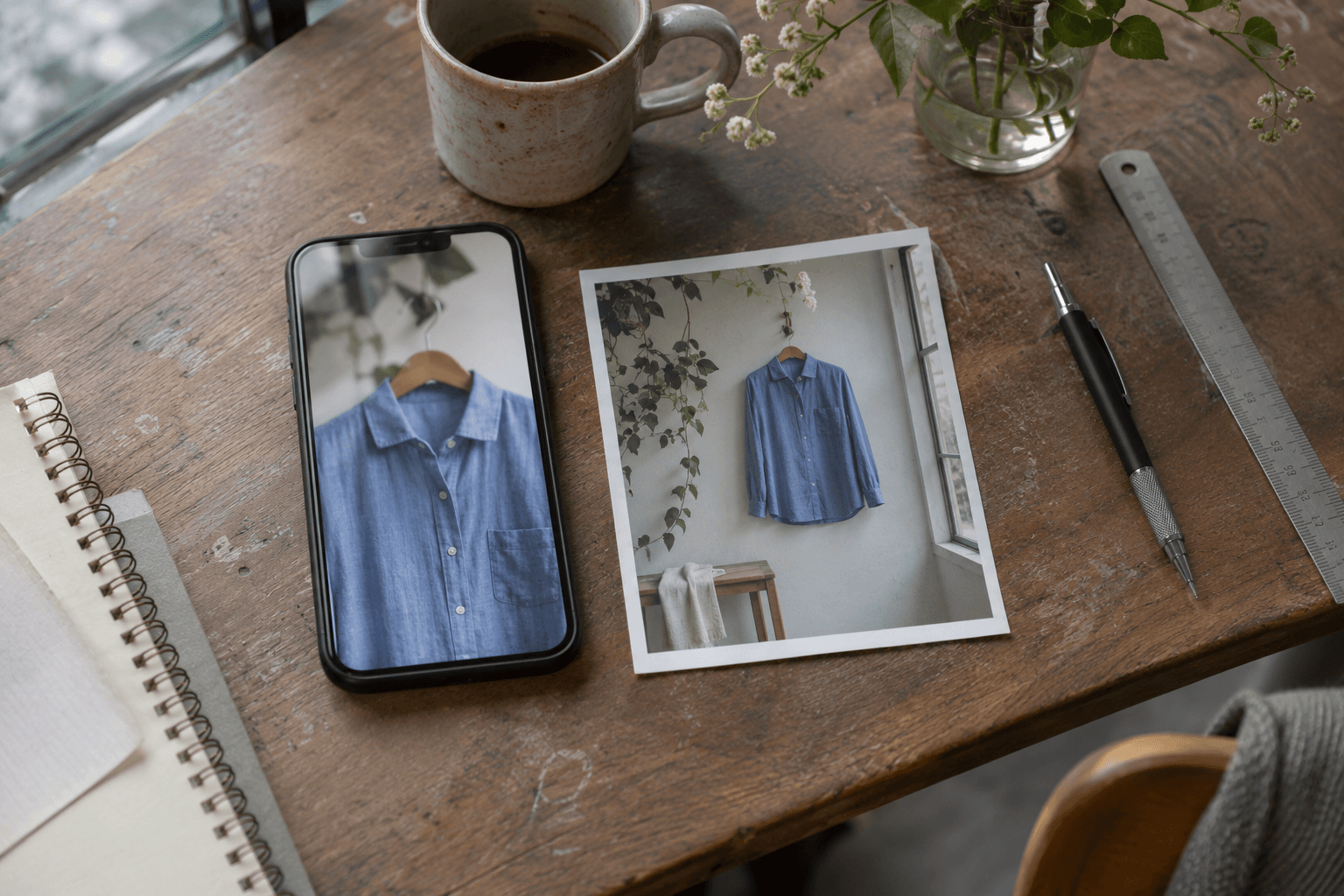
AI-generated photorealistic editorial scene of a smartphone and printed garment photograph on a desk. Conceptual image illustrating mobile image composition; not documentary evidence or a real project screenshot.
Conceptual AI-generated editorial image illustrating a mobile crop and a wider photograph. It is not a screenshot of a client store or evidence of a performance test.
Keep promotional text in the page where practical. A headline baked into a photograph may become unreadable when the crop changes. Also make sure the image area reserves the intended space before loading, especially when desktop and mobile use different proportions.
Use preload only when there is a discovery problem
An image present in the initial HTML can be discovered without waiting for a slider script to insert it. A CSS background or script-inserted hero may take longer to discover. That is one reason to inspect the loading sequence before adding preload.
Shopify’s preload guidance distinguishes discovery from priority: preload helps the browser discover a resource early, while fetchpriority changes the importance of a resource it knows about. Too many preloads compete with the resources that matter.
I would not add a preload to every section as a general speed fix. If a trace shows that one critical image is discovered late, test a targeted change. Confirm that the browser uses the intended responsive candidate and does not fetch an unnecessary second version.
Check what happens when a merchant moves the section
A reusable theme section can be a hero today and appear halfway down a page tomorrow. Its loading policy should match that position. Shopify documents section.index and position-aware loading for this purpose, including contexts where the index is nil, such as the theme editor and Section Rendering API.
Do not paste the eager, high-priority example into every reusable image section. Use it for the confirmed critical placement, then add appropriate position-aware behavior for other placements. Test reordered sections on storefront preview as well as checking that they still render in the editor.
A repeatable test before publishing
- Duplicate the current theme and record the original mobile LCP element and image request.
- Make one change at a time: loading policy, responsive candidates, layout sizes, or crop.
- Repeat several runs with the same viewport, throttling, and cache conditions. Compare the pattern rather than one unusually good score.
- Inspect the selected image URL, transfer size, request timing, and priority. Confirm hidden slides or alternate images are not competing unnecessarily.
- Review sharpness, crop, text contrast, and layout stability on mobile and desktop.
- Reorder the section and test again. Check homepage, product, and collection templates where the same code is reused.
- Keep a short change log and compare live visitor measurements after deployment when enough data is available.
The goal is a banner that arrives when shoppers need it and still shows the product clearly. A smaller download is useful; a smaller download that starts late or looks wrong is unfinished work.
For related Liquid theme development, see my Baby Blossom Shopify store project. The examples in this article are illustrative, not reported performance results from that store. If you need help improving image delivery in a custom Shopify theme, I’m happy to discuss the section and the loading behavior you are seeing.
Primary documentation checked on 2 November 2026. Test the implementation against your theme’s markup and current storefront behavior.